|
I found the idea for this painting online. I mixed the colors for every single color in this painting. Be the good is supposed to be highlighted because people are supposed to believe there is good while being the good that is present in the world. The word "the world" were originally supposed to be the dark blue color of the rest of the text, but that paint was accidentally destroyed, so I improvised. The dots on the side were my idea. I wanted to make them darker little by little and bigger also. This worked very well because of my mixing abilities, and adding very small amounts of blue and black to my mixtures. 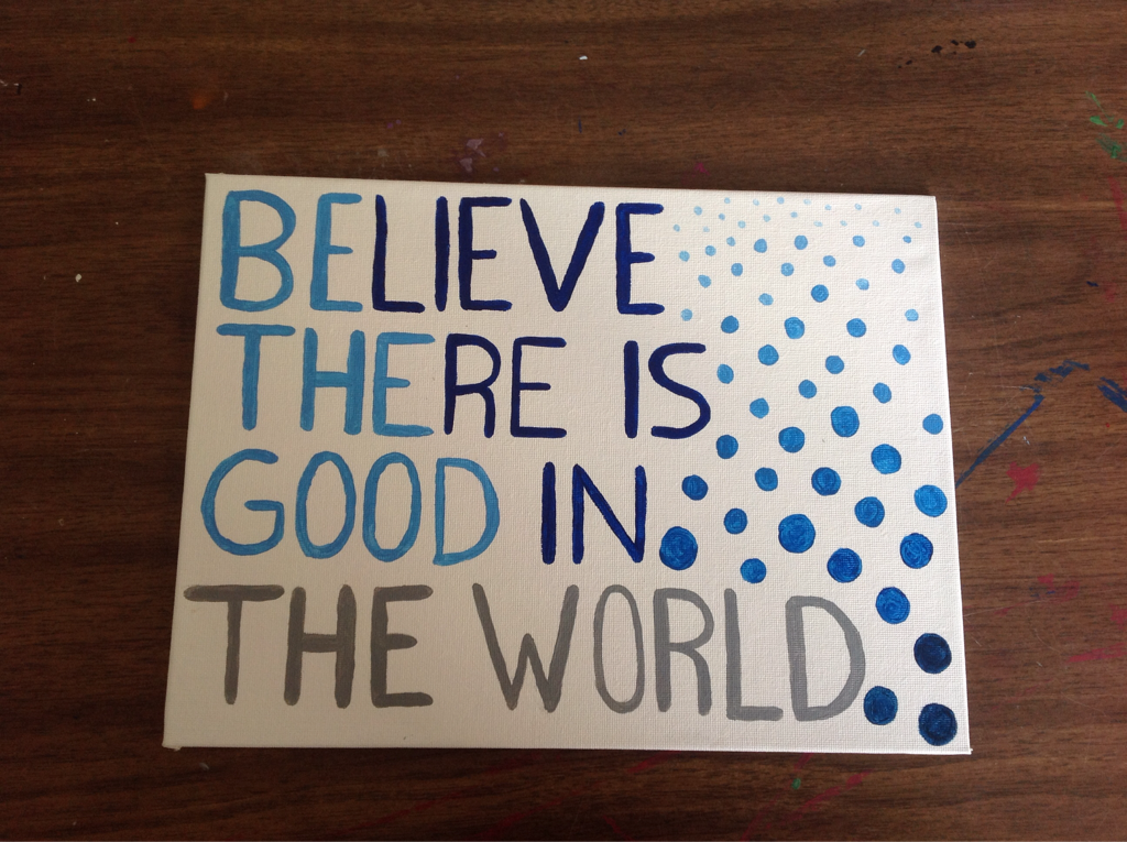
0 Comments
I had the idea for this piece because my friend, Bryce, had one in his house. I thought about doing it and combining many shades of blue and grey. This painting really expanded my paint mixing skills because it allowed me to experiment to make many different shades and tints. I first placed the tape down in the spaces that are now white in order to prevent the paint from being in those spots. I then mixed many different blues and greys, attempting to surround dark colors with light and light colors with dark. 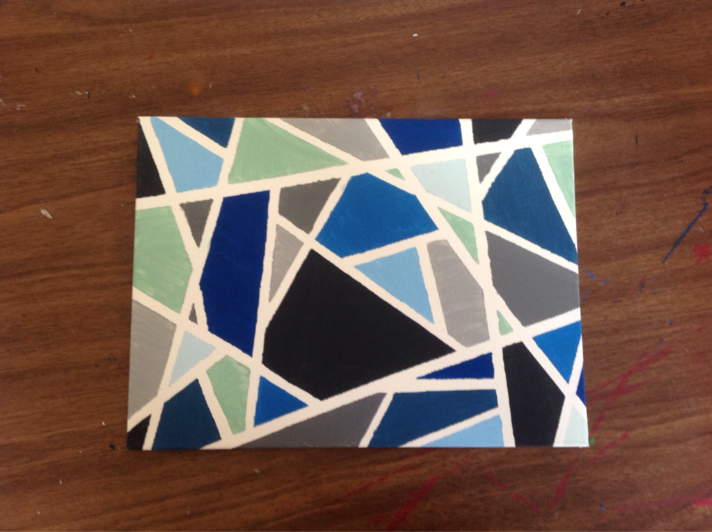 Originally, I was going to make this sunset out of glass and connect it with a soldering iron. However, I decided to make it a mosaic instead. I used the blue pieces that were a bit clear to provide a wave appearance. I made the sun out of non-transparent pieces to make it pop and stand out. The sunset itself was made out of many different colors of glass. I specifically wanted to make it from the sun to the edges of the glass in a bunch of straight lines because it would show that the sunset goes out in all directions. I had to cut each piece of glass and grind each one down, but eventually it all came together to fit. 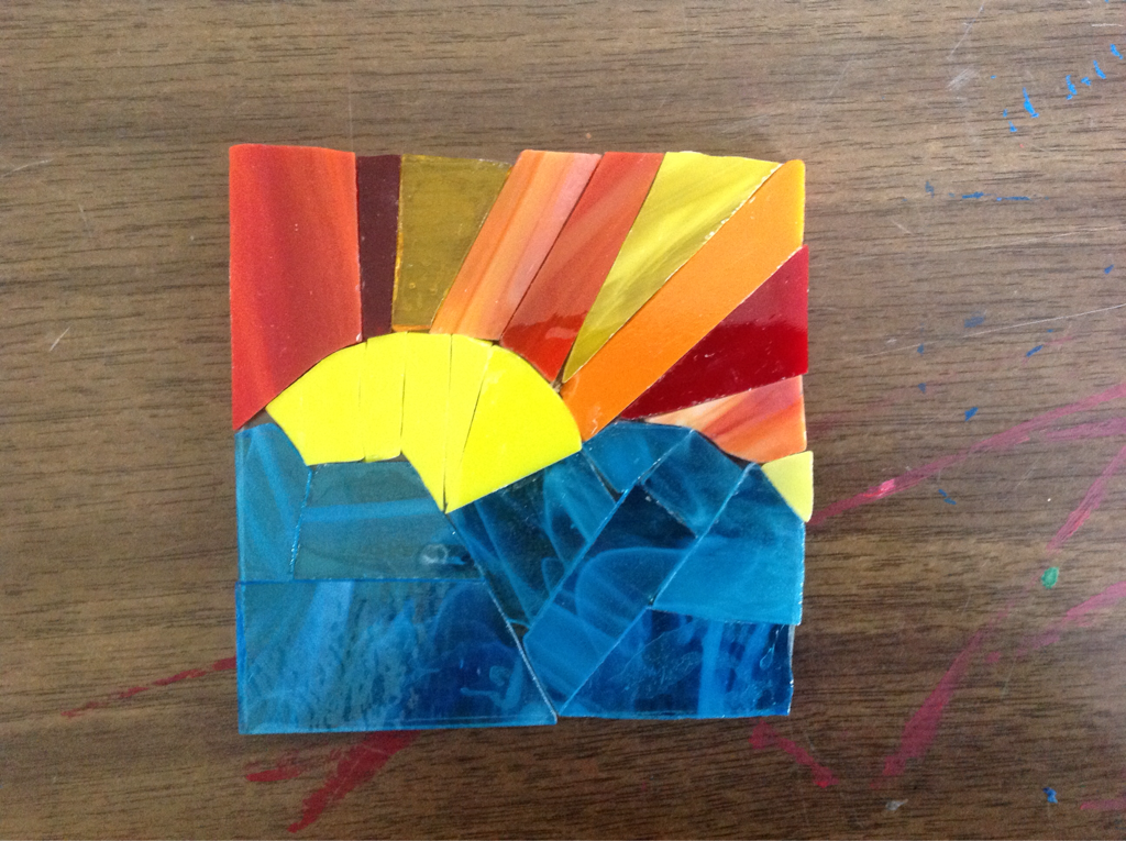 I made a tree that represents the seasons by using different color schemes. Originally, I was going to make red, yellow, and orange dots on both the red and yellow parts and blue, green, and purple dots on the blue and green parts. However, I soon realized that I could represent the four seasons with the four different colors. Summer is represented by the red because of the warm temperatures; fall is represented by yellow and orange because of the change of colors of the leaves; blue was used to represent the icy temperatures of winter, and green was used to represent the growth in spring. I used watercolor paint in order to make the background and acrylic paint in order to make the tree and dots, which represent the leaves. Through this project, I expanded my ability to mix colors and to think outside the box with the dots. 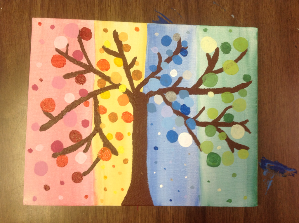 My skills have improved this semester, but the skill that improved the most was improvisation. Throughout the semester, I had started and stopped many projects because they had not turned out as planned. However, I turned those old projects into something new. For example, the fish project was supposed to be an outline of a "T" for my room, but I messed it up and decided to improvise and turn it into a fish. I have also gained a lot of patience because some of my projects took a lot of time to complete. I learned some new skills in mixing paint. Last year in art, I used pre-made colors to paint my pieces, but this year I learned how to mix paint much better and make various new colors. In order to improve my works, I could have practiced painting on the icon panels before I actually started my final drafts in order to conserve resources. I could have also made sketches instead of improvising on some of my works.
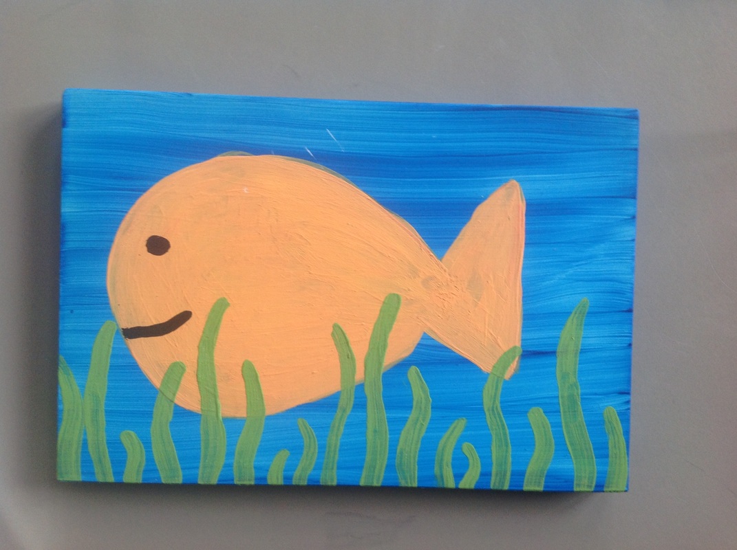 My inspiration for this project actually came by accident. Alex Yacovoni had some unused blue paint that I decided to use to paint an icon panel. For about a week, I did not know what to do with the panel but one day I had just randomly thought that the lines looked like waves. This is when I decided to paint a fish. I mixed the orange paint and painted three coats of orange over the blue to make the fish. I then mixed a green color in order to make the seaweed. I learned that just by looking at something, you can come up with completely new ideas.
Currently, I am making a track baton out of toothpicks. This was inspired by a project that David had done last year, which was Big Ben made out of toothpicks. I wanted to make something to send him at college and since he was running track, I thought that this would be something that he liked. I am using hot glue to glue together the toothpicks into many circular rings that I will glue together to make the shape of the baton. It will be a long work in process, but I am hoping to have it done by thanksgiving.
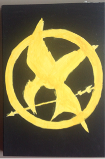 My inspiration for painting this mockingjay was to start off the art class for this year with something that I wanted to paint while exploring new materials. The mockingjay was painted on what is called an icon panel, which I had found in a random box in the art room. These panels had become my newest media for art. First I had outlined the mockingjay with pencil and then I painted the outside black. Then, I mixed the gold color to paint the mockingjay itself and left it to dry. Through this project, I learned what icon panels were and what I could use them for.
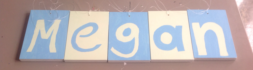 My inspiration for this project was my friend Megan. She had just moved to college, and I wanted to make her something to remember me by that could decorate her room. I had found these icon panels in the art room and decided to use them for a banner. I drilled holes into the top of each of these panels and mixed the two paint colors in order to paint them. The mixing process was a little difficult because I had changed my mind on what color that I wanted many different times, but eventually I was satisfied with my color choices. Then I painted her name in the alternating colors and left it to dry. The trickiest part of this project was trying to find a way for her to hang it up. After trying copper wire and hooks, and realizing that neither of those options worked, I used fishing line to string them together. I strung it through three times each way in order to keep the letters in the same place. Throughout the process, I learned that icon panels are actually heavier than I thought. I also learned how to mix more colors and how to be patient with my results.
|
